 AGreenNest
Plant Styling & Display
Styling Plants by Color: Build a Palette
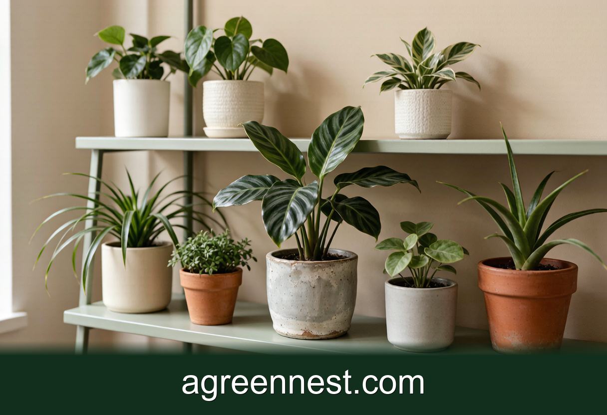
Plant groups look messy when too many foliage colors compete. Choose three greens as your base, roughly 60 percent mid green, 30 percent deep green and 10 percent pale or silver, then allow one accent color such as burgundy. Keep pots to two materials so the leaves stay the loudest thing in the room.
A friend asked me to look at her living room because the plants "were not working". Every one of them was healthy. Good roots, no pests, decent light, eleven pots in a bay window that got 4 hours of direct sun a day.
The problem was that she owned eleven different colors. Silver Scindapsus pictus, burgundy Tradescantia zebrina, near-black Alocasia, chartreuse Epipremnum aureum 'Neon', a variegated rubber plant, three shades of terracotta and two glazed teal pots. Nothing was wrong and nothing agreed with anything.
We moved four plants to other rooms. Same window, same light, and the corner suddenly read as a designed thing rather than a shop shelf.
Why Do Healthy Plants Still Look Cluttered?
Because your eye reads color before it reads shape, and green is not one color.
Foliage runs from the yellow-green of Epipremnum aureum through the blue-green of Sansevieria trifasciata to the near-black of a mature Ficus elastica 'Burgundy'. Those greens sit in different places on the color wheel, and five of them side by side create the same visual noise as five clashing cushions.
The fix borrows from interior design rather than horticulture. Give a group a dominant color, a supporting color and a small accent, in roughly a 60 / 30 / 10 split. Applied to plants that means most of the group shares one green family, a smaller portion contrasts, and one plant is allowed to be the loud one.
Grouping mechanics like odd numbers and staggered heights are covered in plant grouping rules. Color is the layer people skip, and it is doing more work than either.
Start With Three Greens, Not Ten
Pick your three before you shop, and write them down.
Mid green, roughly 60 percent of the group. This is your quiet majority. Epipremnum aureum, Philodendron hederaceum, Chlorophytum comosum, Spathiphyllum wallisii. These read as neutral and they let everything else register.
Deep green, roughly 30 percent. Weight and shadow. Ficus elastica, Zamioculcas zamiifolia, Aspidistra elatior, Monstera deliciosa. A group with no dark green looks washed out, especially against a white wall.
Pale, silver or chartreuse, roughly 10 percent. The lift. Scindapsus pictus, Peperomia argyreia, Begonia rex in its silvered forms. One or two of these in a group of eight is plenty. Four of them and the whole arrangement starts to look dusty.
I keep a photo of each group on my phone in black and white. Stripping the color out shows you the tonal spread instantly. If everything turns the same mid grey, you need a darker plant. If it looks like a chessboard, you have too much contrast.
The Pot Is 40 Percent of the Color You See
Measure a plant group from 3 m away and the pots take up something like a third to half of the visible mass. A collection of mismatched pots will fight your foliage palette no matter how carefully you chose the leaves.
Two rules keep it calm.
Two materials, maximum. Terracotta and white ceramic. Or matte black and pale stoneware. My own flat runs unglazed terracotta plus one cream glaze, and that decision alone did more for the place than any single plant. Unglazed clay also has the practical advantage of drying faster, which matters for the plants you put in it, as set out in terracotta versus plastic pots.
Repeat, do not match exactly. Eight identical pots can feel like a garden centre display. Three terracotta pots in three sizes with one cream pot among them reads collected rather than bought. The argument both ways is in matching pots versus mixed pots.
One more thing about wall color. A pale wall with a light reflectance value above about 70 throws light back onto the foliage and flatters silver and variegated leaves. A deep wall below LRV 20 swallows dark plants completely, so put your chartreuse and silver plants there instead and save the Ficus elastica for the pale side of the room.
Where Does Red or Purple Foliage Actually Work?
In small doses, at eye level, and near something warm.
Burgundy and purple foliage such as Tradescantia zebrina, Oxalis triangularis and Calathea roseopicta has a habit of vanishing against dark furniture and looking muddy under cool light. Give one of these a position where light rakes across it, then keep every neighbour green.
Three placements that work in my experience. On a shelf 140 to 160 cm up, backlit by a window, so the leaves go translucent purple. Trailing over the edge of a pale bookshelf where the color has plain background behind it. Or as the single accent in a group of five green plants, positioned slightly forward of the rest.
What does not work is two accents in one group. Burgundy Tradescantia next to a red Aglaonema cancels both, and the eye gives up trying to find the focal point. The same restraint applies to layering by height, which is explained in plant height layering.
Treat Variegation as White Paint
Variegated plants are not green plants with a pattern. They are two colors, and the white part behaves like paint in a room: it brightens, it draws the eye, and too much of it looks busy.
A useful ratio is one strongly variegated plant per four to five plain ones. Monstera deliciosa 'Thai Constellation', variegated Epipremnum, Dracaena fragrans 'Lemon Lime' and Ctenanthe all pull focus hard. Put two of them side by side and the pattern reads as visual static from 4 m away.
There is a growing cost too. Variegated tissue has less chlorophyll, so those plants want brighter positions, often 30 to 50 percent more light than the plain form, to hold the pattern. A variegated pothos parked in a dim hallway reverts to plain green within a few months and your accent quietly disappears.
Texture is the alternative when you want interest without adding color, and that is a whole approach on its own in textured leaf plants for styling.
Frequently Asked Questions
Q: My room has warm oak floors and a lot of brass. Which foliage colors suit that best?
A: Deep and mid greens with a chartreuse accent. Blue-green plants such as Sansevieria trifasciata can look cold and slightly grey against orange-toned wood. If you love the blue-greens, put them in cream or white pots rather than terracotta, which pushes the warmth further.
Q: Can I keep a colorful collection and still make it look calm?
A: Yes, by separating rather than editing. Give each color family its own zone in the room, so all the silvers live on one shelf and the burgundies sit together in the opposite corner. Distance does the work that restraint would otherwise do.
Q: Does the color of a pot affect how the plant grows, or only how it looks?
A: Both, a little. A black pot in a south window can run 6 to 10 °C warmer at the root ball than a white one on a sunny afternoon, which dries the mix faster and can stress shallow roots. In a north room the difference is negligible and you can choose purely on looks.
Q: How many plants before a group needs a palette at all?
A: Around four. One or two plants read as objects, and their color barely registers. From four upward the eye starts grouping them, and any color that does not belong shows up straight away.
Q: Should flowering plants count in the palette?
A: Count them as an accent while in bloom and as background green the rest of the year. A Phalaenopsis in flower is a strong ten percent accent for eight to ten weeks, so avoid putting it next to burgundy foliage or the two will argue.
Choose three greens, allow one accent, and hold your pots to two materials. That is the whole method, and it takes an afternoon of moving things around rather than any new purchase. If a plant has to change rooms to make the palette work, check the new spot will actually keep it alive first with our window light estimator, because a beautiful arrangement in a dark corner is a slow goodbye.
Sources & further reading
GreenNest authors research and write every guide independently. The external links below are reputable references we recommend for deeper reading — they are not the sources we copied from.
- Royal Horticultural Society — Houseplant care — RHS
- Missouri Botanical Garden — Missouri Botanical Garden
- NC State Extension Plant Toolbox — NC State Extension
Recommended Tools for Plant Styling & Display Care
Free, no-signup helpers matched to this guide.
Free Ebooks to Explore
Downloadable handbooks — no email required.
Free Ebook
The AGreenNest Succulent Care Handbook
The complete, beginner-to-confident guide to growing fat, happy succulents — 10 chapters and a 20-plant directory.
Free Ebook
Haworthia & Haworthiopsis Care Handbook
A focused guide to the striped, forgiving Haworthia clan.
Share Your Plant Story
Grown something tricky, or found a trick that finally worked? Tell us in the comments, or see what other readers are sharing on our Community page. The best reader tips get folded back into our guides.
Join the Conversation
Have a tip or a question about Styling Plants by Color: Build a Palette? Share it below — comments are saved on our server.